Graph

E-Commerce vs. Gas Prices

Source: 

http://today.msnbc.msn.com/id/44177666/ns/today-today_news/t/high-gas-prices-boost-online-sales/

Image: 

E-Commerce vs. Gas Prices

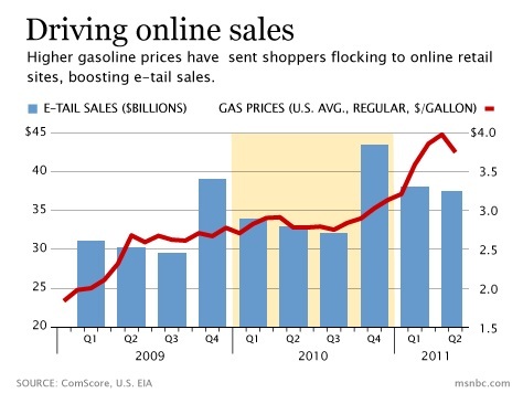
Increasing gas prices seems to correlate with increasing e-tail sales and could be one of the many factors as to why e-commerce is getting popular.  There is a significant increase in e-tail sales during the fourth quarter due to Christmas shopping, but we can see the steady increase of e-tail sales over time when comparing the same quarter each year.

Image Type: 

Category: 

Level: 

Geographic Area: 

US house prices

Source: 

http://realtyexcursions.com/2011/03/has-the-market-stabilized/

Image: 

US house prices

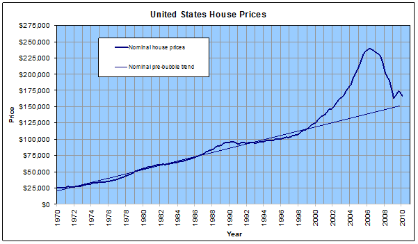
This image shows the "nominal" house prices in the US for the last 40 years.

The thin blue line is what someone in 2000 might have expected houses prices to do during the first decade of the 21st century.

Image Type: 

Category: 

Level: 

Geographic Area: 

Gold price since 1970

Source: 

http://www.usagold.com/reference/prices/history.html

Image: 

Gold price since 1970

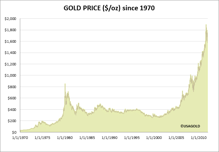
This picture shows the rising price of gold.

The gold price rising because it's considered a safe-haven. It's essentially a currency that cannot be ;anipulated by the interest rate policies of anyone government.

Image Type: 

Category: 

Level: 

Geographic Area: 

Youth unemployment across Europe

Source: 

http://marginalrevolution.com/marginalrevolution/2012/02/youth-unemployment-across-europe.html

Image: 

Youth unemployment across Europe

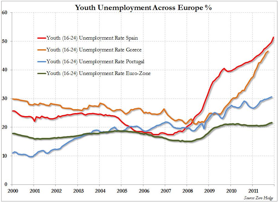
This graph describe the youth unemployment across Europe, in Euro-zone and in three european countries Spain Greece and Portugal

Image Type: 

Category: 

Level: 

Geographic Area: 

History of Crisis

Source: 

https://www.historyshots.com/FinancialCrisis/index.cfm

Image: 

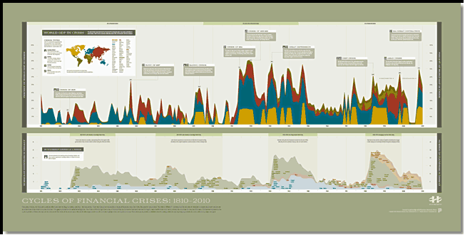
History of Crisis

This graphic is based on the New York Times and Wall Street Journal best seller This Time Is Different: Eight Centuries of Financial Folly by Carmen M. Reinhart & Kenneth S. Rogoff. Using data developed by Reinhart and Rogoff, it maps the cyclical history of financial crisis from 1810 to 2010 for sixty-six countries representing 90% of world GDP.


Level: 

Image Type: 

Category: 

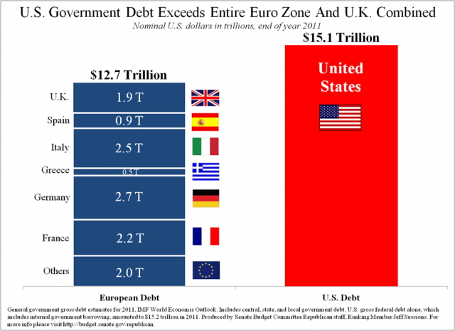
U.S government debt exceeds entire Euro zone and U.K combined

Source: 

http://www.google.com/imgres?um=1&hl=en&client=firefox-a&sa=N&rls=org.mozilla:en-US:official&biw=932&bih=658&tbm=isch&tbnid=Ra3080BNgHpwaM:&imgrefurl=http://www.whatamimissinghere.com/archives/41725/us-government-debt-exceeds-entire-euro-zone-and-uk-combined-graph&docid=c7eqoA-shq1RFM&imgurl=http://www.whatamimissinghere.com/wp-content/uploads/2012/04/US-Government-Debt-Exceeds-Entire-Euro-Zone-and-UK-Combined-Graph.jpg&w=500&h=363&ei=FuUiUOb_C8mriAK8wYCQDg&zoom=1

Image: 

U.S government debt exceeds entire Euro zone and U.K combined

The U.S debt topped $15 trillion in 2011; while the U.K and Euro zone's collective debt amounted to approximately $13 trillion.

Level: 

Image Type: 

Category: 

Pages