Facebook Posts
Submitted by shirab12 on
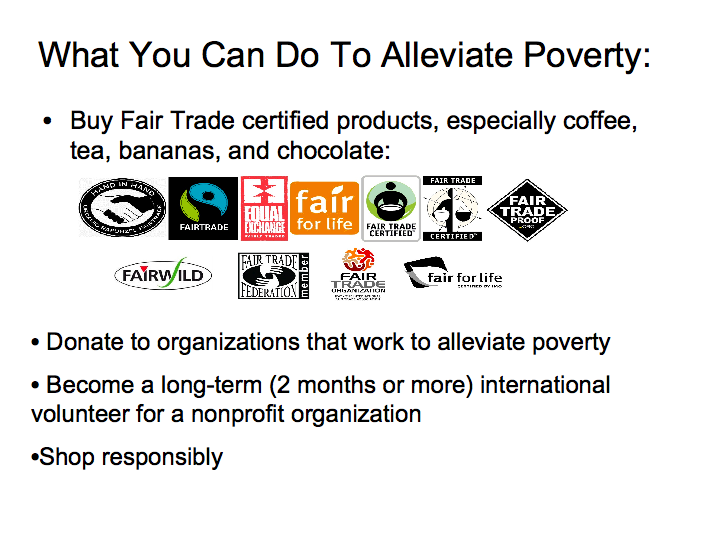
What You Can Do to Alleviate Poverty
Submitted by shirab12 on
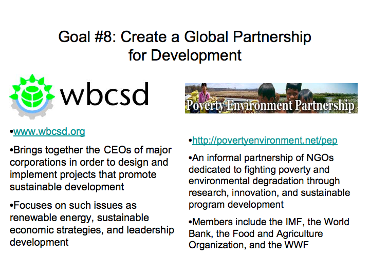
Organizations Working to Create a Global Partnership for Development
Submitted by shirab12 on
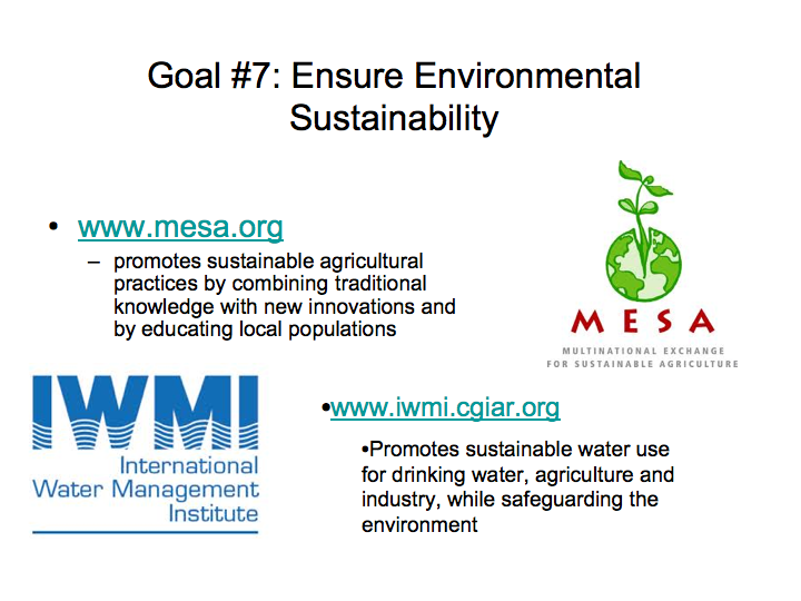
Organizations Working to Create Environmental Sustainability
Submitted by shirab12 on
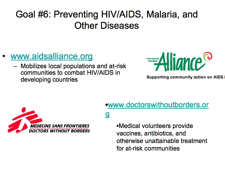
Organizations Working to Prevent or Treat Global Infectious Diseases
Submitted by shirab12 on
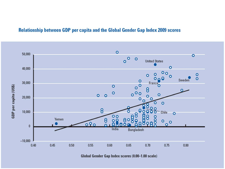
Relationship Between GDP Per Capita and the Global Gender Gap Index of 2009
Submitted by shirab12 on
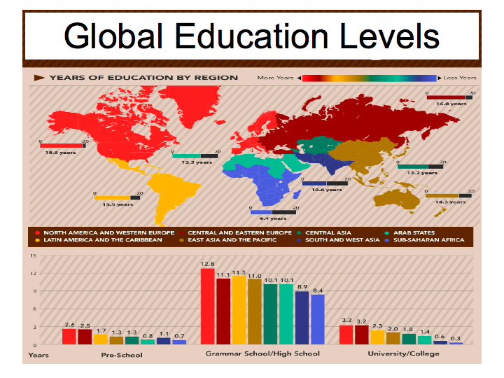
Global Education Levels
Submitted by shirab12 on
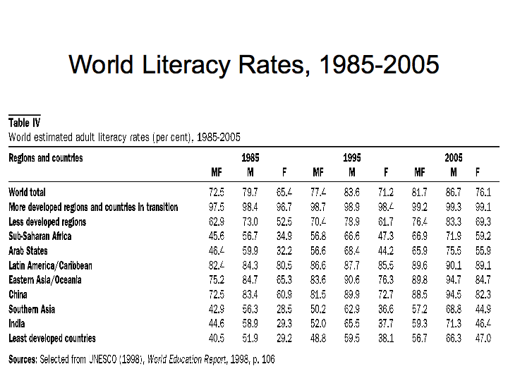
World Literacy Rates (1985-2005)
Submitted by shirab12 on
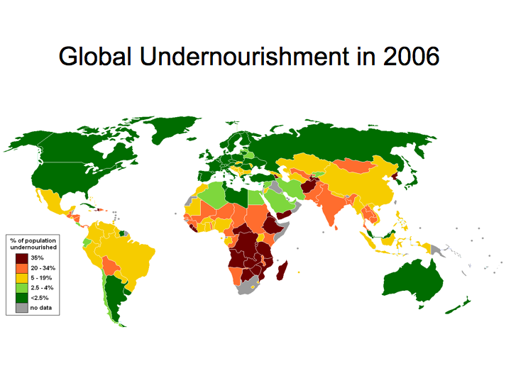
Global Undernourishment (2006)
Submitted by shirab12 on
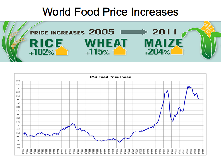
World Food Price Increases Over Time
Submitted by shirab12 on

